10 excellent tools to find the perfect website color palette
This post may contain affiliate links. This means I get a commission if you purchase through my links at no extra cost. Read the full disclosure here.
Choosing the right website color palette is more than just picking a few favorite tints and tossing them in.

The colors of a website or blog should resemble the mood of your site, and combinations should be well thought out.
There must be a balance to picking colors that not only please you but also serve your audience.
Follow this guide, and you’ll soon be on your way to choosing a great website palette with which everyone can be happy.
Choosing your website colors
Whether you’re just starting a new website or considering changing the palette of your present website, you do not want to choose this by chance or whatever looks fun.
Surely, you want an exceptional, attractive color scheme, but you must give it enough thought. Consider that colors spark feelings that influence how people see your site. Color also affects decisions visitors make on your site. For instance, simply changing the color of a link or a “buy now” button can improve conversions.
To help select the best website color palette, watch the video from Neil Patel. This video helps you better understand how to choose a color scheme for your website.
The colors of a website should reflect your business’s goals, values, and beliefs. When the website color palette is carefully used within a website, it will delight your visitors and make your brand memorable.
Use these colors faithfully in all your designs. You can use them for example:
- In your logo
- On social media
- In advertisements
- In your email newsletters
- Style of your web images
Do colors affect website performance?
Yes, colors can influence website performance. For example, research has shown that websites with more contrasting colors are more visually appealing and can help attract more visitors.
Additionally, using colors consistent with the company’s brand identity is important, as this can help reinforce the company’s message and create a more cohesive user experience. Finally, using colors that match the website’s overall theme or design can help make navigation easier and the user experience more enjoyable.
How many colors should you use?
The choices are endless when searching for the perfect colors for a website or blog.
Wherever you look around you, you can find inspiration, and it can be challenging to narrow down to a few palettes.
Most websites use more than three colors. One as the primary, one as the secondary, and an accent color.
Mind, too many colors can become confusing for your visitors. When using four-color palettes, make sure the colors look good and balanced.
However, you can just pick one or two colors if you strive for a more minimalistic look.
Get inspiration from others in your niche.
A good start is to check out what colors your competitors are using. Successful blogs have a brand palette that resonates with the audience in this niche.
I recommend checking out at least three direct competitors’ websites and looking for overlapping color choices in their designs.
And then it is up to you. You can:
- Create a similar palette that is proven to be successful.
- Or choose something entirely different to separate yourself from the crowd.
If you come across an eye-catching design, you can export the hex codes and try how they look on your website. Mind, you should be careful here. If one of your biggest competitors has a distinct brand color, copying it will not help your business.
How do I find the color palette of a website?
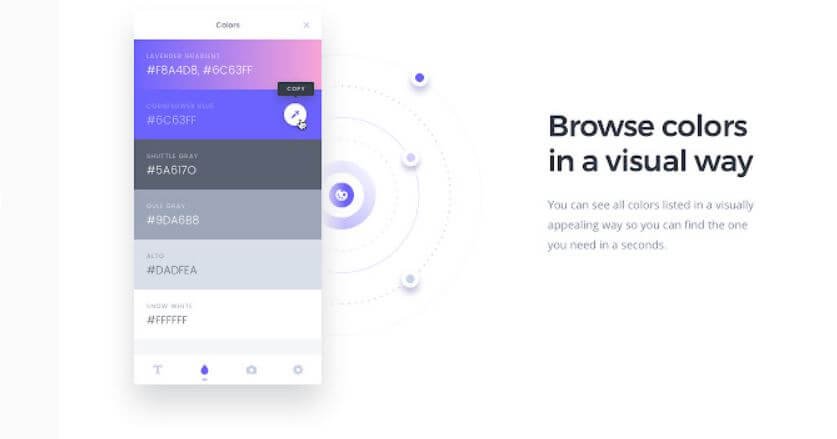
CSS Peeper is a free chrome web extension that lets you inspect the fonts, styles, and color schemes a website uses.
How to quickly extract a color palette from an image
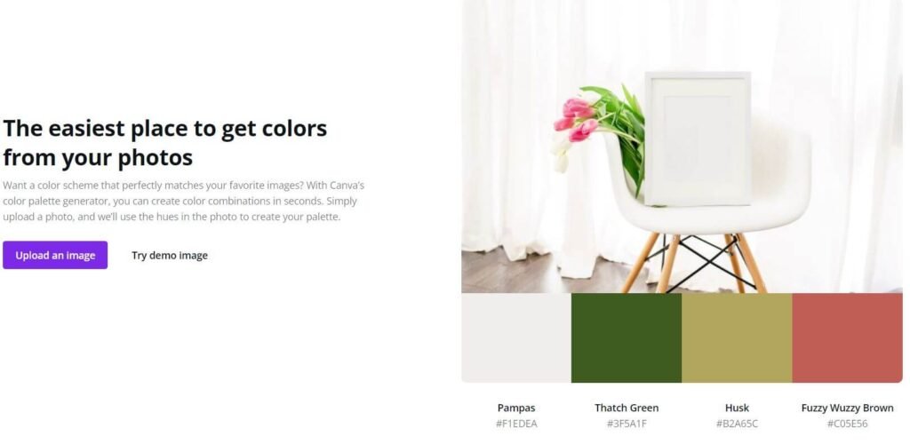
A great way to quickly extract a website color palette from an image is to use a program such as Adobe Photoshop. Once the image is loaded, you can use the color picker tool to select any number of colors from the image.
You can save the color palette for other programs or projects. Additionally, various online tools are available for extracting a color palette from an image, such as Coolors or Adobe Color. These tools provide quick access to the color palette of an image.
Additionally, you can quickly pull hex codes from an image with the free online color generator tool from Canva.
If you can’t find images to create a lovely palette. Here are two of my favorite sites where you can discover stylish stock images with matching palettes:
- HauteStock
- Styled stock society
10 of the best places to find a website color palette
A few of these tools call for a color to start with. But a quick search on Pinterest will show you loads of ready-to-use palettes. Here, you can find undoubtedly something unique for your brand.
Add your color pallet to WordPress
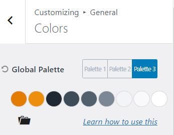
Now, the moment has come to add your chosen website color palette to WordPress. If you already have a theme, add them to the customizer. The average WordPress theme allows you to set the colors of your fonts, links, and backgrounds within the customizer area without understanding any code.
This blog uses the Kadence theme, which has nine colors in its global palette. See below how you can apply these to your website:
How to apply a color palette to the elements of a website?
Let’s assume you start with three focus colors and build your palette from there.
No 1. The Accent color
For the accent color, choose the one that represents you the most. We use this to highlight the elements we want to catch our visitor’s attention. For instance, links, buttons, icons, or your site’s top navigation. You must choose this color carefully, as it reflects your brand.
Once you have picked your accent color, the next step is to create 2 to 3 similar tints. You can use these for hover effects.
No 2. The Neutral Color
The neutral color you will be using the most. Usually, this is white, light grey, or something similar. The neutrals will take up the most significant part of the design, let’s say, the background. Choose a few variations to use in your social media templates.
No 3. The Contrast Color
To finish your palette, you will want to add a contrasting shade. Typically, this needs to be dark and dynamic.
Contrast colors are usually black and shades of grey, and we use them for the body text and headings of the website. Additionally, you can apply them to the header and footer backgrounds. Yet again, you may want to add some variations. It’s good to create several lighter versions to add a stylish and sophisticated feel to the design.

A lot of factors go into choosing the color scheme for your website. When you’re trying to launch a website, it gets more challenging. It’s essential to consider the psychological and cultural impact of various website color palettes and how they may impact your brand’s image.
So, do you have a favorite color palette generator? Where did you get inspiration for your website color palette? What makes it so unique for you? Like to share it with our readers? Let me know in the comments!




![5 Effortless Steps to Crafting an Engaging Blog Newsletter [ a beginner's guide] 12 Girl typing newsletter on laptop](https://onefoxyblogger.com/wp-content/uploads/2023/03/crafting-newsletter-ft-768x403.jpg)